Scroll down to read in English
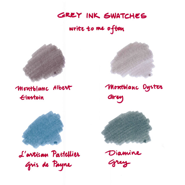
Bildiğiniz gibi, Montblanc yakın zamanda Albert Einstein'a ithafen bir kalem ve bir mürekkebi piyasaya sürdü. Albert Einstein'e ithaf edilen bu mürekkebin gri olması ve halihazırda Montblanc'ın Oyster Grey isimli, benim de şurada incelediğim bir mürekkebinin mevcut olması mürekkepseverlerde bir kafa karışıklığına yol açtı. Acaba bu iki gri birbirine ne kadar benziyordu? Ben de hazır bu iki griyi karşılaştıracakken, elimdeki diğer gri mürekkeplerden de bir swatch yaptım.
Gördüğünüz üzere, Albert Einstein mürekkep, Oyster Grey'e göre daha koyu, L'artisan Pastellier ise daha çok mavi alt tonlu bir gri. Bunlar içinde en koyu olanı ise Diamine'in gri mürekkebi.
Siz en çok hangisini beğendiniz?
Sevgiler,
Zeynep :p
CONTINUE to READ in ENGLISH
As you know, Montblanc recently launched a fountain pen and an ink in memory of Albert Einstein. The ink dedicated to Albert Einstein was in grey tones and since Montblanc has already a grey ink Oyster Grey (please click for the review), ink enthusiasts were a bit confused wondering how much this inks were look-alike? Therefore, when I decided to compare those two inks, I wanted add my other grey inks to the swatch.
Seen above, Albert Einstein ink is a bit darker than Oyster Grey while L'artisan Pastellier is much more a blue-grey. And the darkest grey ink is the Diamine Grey among them.
Which one did you like the most?
Cheers,
Zeynep :p