Quantcast
Channel: Write to Me Often
Viewing all 566 articles
Browse latest View live

Promotional Notebooks Yay or Nay? / Esantiyon Defterleri Kullanıyor musunuz?

$
0
0
Scroll down to read in English

Yeni yıl kapıda... Bu da demek oluyor ki, şirketlerin yıllık olarak kendilerini hatırlattıkları ajandalar da yakın zamanda kurumsal şirketlerde çalışanların kapılarını aşındırmaya başlayacak. Ben şahsen şimdiye kadar hediye gelmiş hiçbir ajandayı kullandığımı hatırlamıyorum. Ne kadar güzel ve kaliteli de olsa, üzerinde yazan devasa isim, iç sayfalarındaki kocaman reklamlar beni yorar. Bu yüzden bugün size iyi bir promosyon defter nasıl olur, Metal Yapı'nın defteri üzerinden göstermek istedim. 


Hem bir dolmakalem gurmesi, hem de Metal Yapı'nın reklam müdürü olan Fatih bana hediye olarak defter getirmek istediğini söylediğinde teşekkür etmiş ama içimden "inşallah kullanmadan kenara kaldıracağım bir defter olmaz" demiştim. Ve son günlerde en çok kullandığım defterlerle böylece tanışmış oldum.


Fatih, bu defterleri kendisi yaptırmış. Her defter sırt dikişli. Dikiş rengi içteki kapak rengi ile uyumlu. Örneğin iç kapak sarı ise, sırt dikişi de sarı oluyor. 


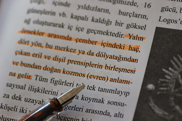
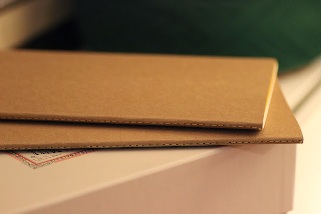
Gelelim defterin kağıdına... Defterde kağıt olarak 80 gr fildişi, kapakta ise 300 gr kraft kağıt kullanılmış. (Bu sene 90 gramlık kağıda basılacakmış eşantiyon defterler. Yaşasın!) Defterleri yaptırmak için noktalı kağıt bulunamayınca, fildişi kağıtlara matbaada gri noktalar bastırılmış. Defterin bir diğer özelliği ise, sayfa kenarlarının perforeli olması. Böylelikle, bir sayfayı kopartmak için defterin cildini bozmak zorunda kalmıyorsunuz.


Defterin arka kapağında, körüksüz de olsa bir cep bulunuyor. Evet körüksüz ama yine de cep :)


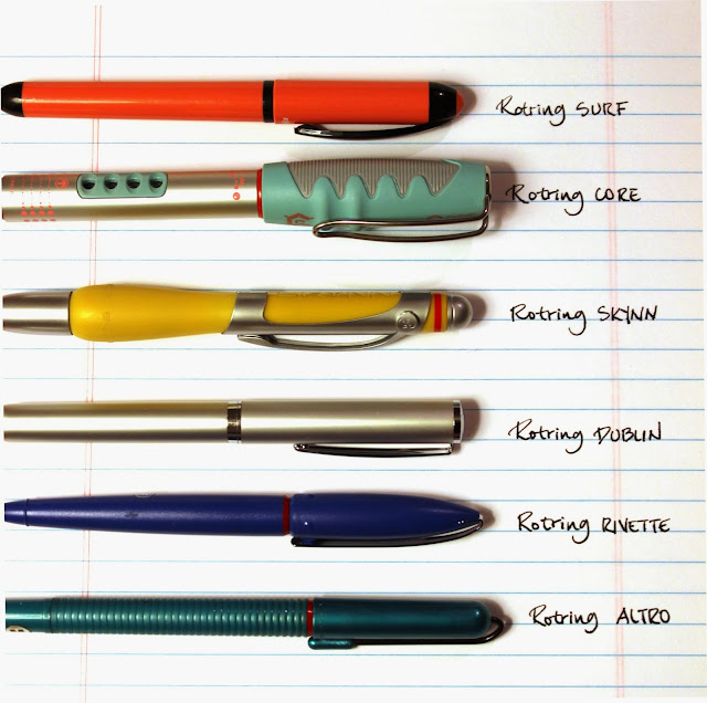
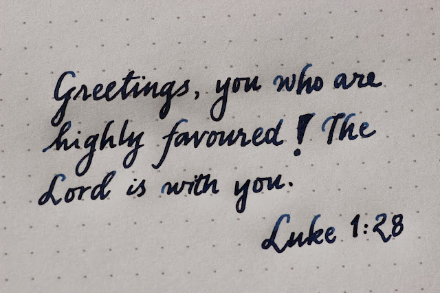
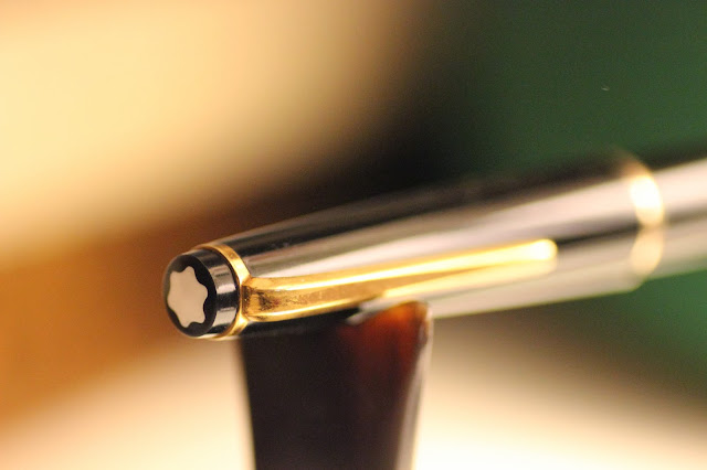
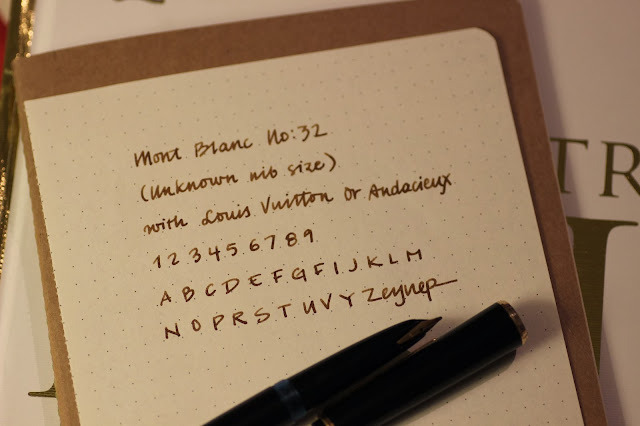
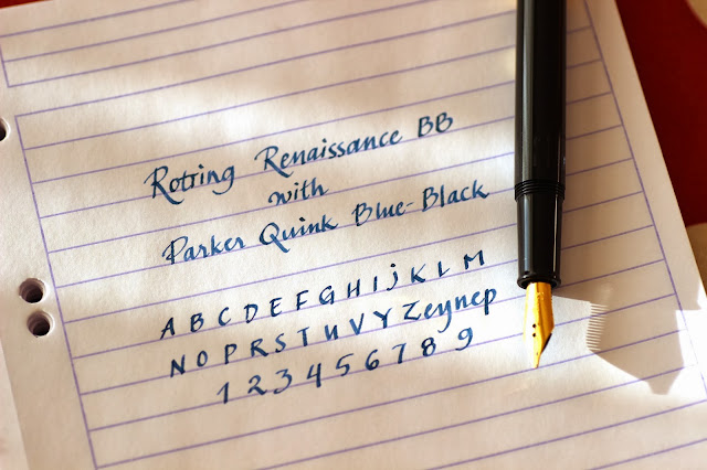
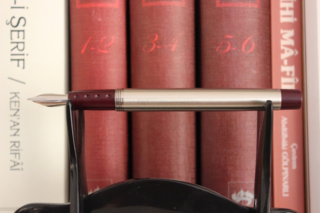
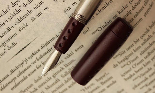
Evet, yine muhteşem bir blogger özelliği olarak fotoğraf ters döndü :( (Bu arada, blog tasarımı yapıp, altyapıyı da daha iyi hale getirmek üzere ajans veya web designer önerilerinize açığım) Defteri Sailor King of Pen, Waterman Harley Davidson, Montblanc No:32 ve şimdiye kadar kullandığım en ıslak kalem olan Faber Castell Ambition ile denedim. 


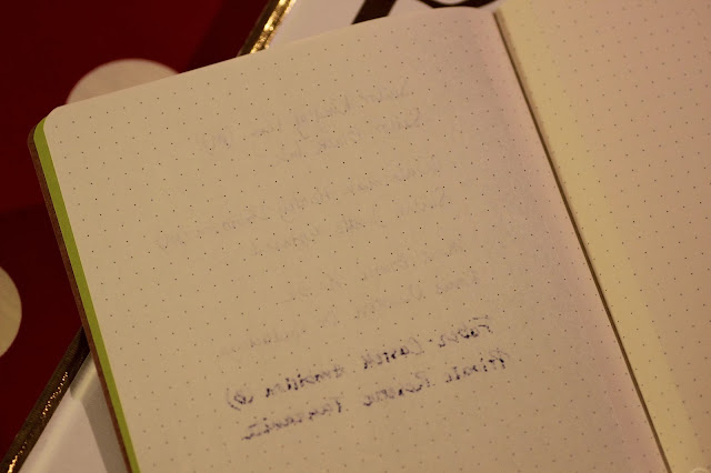
Genel performansını seviyorum. Ama çok ıslak kalemlerde arkaya geçiyor. Ben son zamanlarda sürekli bu defteri taşıyorum. Defter çok kalın değil, boyutları da 14x21 cm. Eskiden çantamda taşımak üzere ufak defterler alıyordum ama o defterlere uzun uzun yazmak zor oluyordu. Bu defter hafif ve ince olduğundan çantada taşımak için oldukça ideal. 

Demem o ki, eşantiyon da olsa, bir defteri insanların ihtiyaçlarını görecek şekilde tasarlamak mümkün. Geçen sene bana gelmiş ve kapağında devasa isimler yazan, iç sayfalarında neredeyse yazılacak yer olmadığı için atılan ajandaların hangi şirketlerden geldiğini hatırlamıyorum. Metal Yapı'nın defterini ise aldığımdan beri her daim çantamda taşıyorum. Sizce hangisi kendini daha iyi hatırlatıyor? Çok para harcayıp afili ajandalar yapanlar mı, yoksa defter kullanacak kişilerin ihtiyaçlarını düşünerek sade tasarımlar yapanlar mı?

Sevgiler,

Zeynep Kalemsever


CONTINUE to READ in ENGLISH


"Winter is coming!" It means that, promotional agendas and notebooks will appear on our desks soon. I, myself have never been a fan of promotional notebooks or agendas so far. Even though they bear high quality, I am quite turned off by big corporate names on the cover or ads inside. Therefore I would like to introduce you with the best practive I have ever seen so far. 

When Fatih a fountain pen gourmet as well as the Advertising Manager of Metal Yapi told me that he will be bringing some notebooks for me, I thanked but I have to admit I murmured myself "Hope not another notebook to put aside without using". And this is the story of how I met with (your mother) my frequently used notebooks of nowadays. 

Fatih, customized those notebooks by himself. They all have back stitches matching with the inner cover. If the inner cover is red, then the back stitch is also red. 

And what about the paper? For the inner pages 80 gr ivory and for cover it is used 300 gr craft paper. (This year the promotional notebooks will be printed on 90 gr paper) Since they cannot find dotted paper to make the notebooks, they made it printed in a printing center. Another quality of the notebook is that all the pages have perforation on the side. So you don't harm the spine of the notebook while you are tearing down a page. 
 
On the back of the cover, there is a pocket. I know it is not folded but still a pocket! Pockeeeetttt :)

Again as a great blogger feature we have a rotated photo!!! I tried the notebook with Sailor King of Pen, Waterman Harley Davidson, Montblanc No:32 and the wettest pen I have ever used Faber Castell Ambition. 

I like the general performance of this notebook but it bleeds with the wet pens. Recently I have been carrying this notebook all the time. It is not very thick and the sizes are 14x21 cm. I used to carry very small notebook in my bag but I realized they are not very comfortable for long writing sessions. But since this one is quite lightweight and slim, it is ideal to carry in the bag. 

To put in a nutshell, even though it is promotional, it is possible to design something to match with people's needs. I don't remember any of the agendas I recieved last year, since they had giant names on the covers and merely a place to write inside because of the advertisements. But I carry this notebooks since I received them. Who makes itself reminded? Ones spending more, making big fancy agendas or the ones designing a plain notebook with considering the needs of people who will use it?

Cheers,

Zeynep Penthusiast

Rotring Fountain Pen Inventory Part I / Rotring Dolmakalem Envanteri Bolum I

$
0
0
Scroll down to read in English


Efendim bilenler vardır. Bir süredir Rotring dolmakalemleri aşkla ve şevkle topluyorum. Ben şahsen bu biriktirme sürecinde bazı kalemlerin modellerinin ne olduğunu bulmakta epey zorlandım. Hatta hala modelini belirleyemediğim, Rotring'den (günlerdir) cevap beklediğim bir kaç kalem de mevcut. Ben de bu arada, en azından denk gelirseniz kalemleri tanıyabilesiniz diye faydalı olacağını umduğum bir envanter çıkartmaya çalışıyorum.


Daha sonra detaylı incelemelerini yapacağım ama şimdilik kısaca tanıtayım. İlk kalemimiz Surf, ailenin en ucuz kalemi. Diğeri "ya seversin ya nefret edersin" Core. Muhtelif renkleri ile oldukça orijinal bir kalem. Üçüncü kalem yine oldukça tartışmalı Skynn. Onun da kırmızı, mavi gibi renkleri var ama ben sarıyı seçtim. Dördüncü kalem, pek bir yerde bulunmayan Dublin. Beşinci kalemimiz yine farklı renklerde üretilmiş plastik gövdeli Rotring Rivette. Ve son kalemimiz plastik gövdeli, uzaylı anteni şeklinde bir klipse sahip Altro. (Kendisinin bir de metal ağabeyi var. Onu sonra göstereceğim)


Kalemlerin uçları da bu şekilde. Sadece Dublin'in ucunda iridium point germany yazıyor. Diğer tüm uçlar Rotring'e özel uçlar. Genel olarak da yazım kaliteleri güzel. Yazının devamı gelecek, zira kalemlerin devamı var :)

Nasıl? Siz Rotring dolmakalemler hakkında ne düşünüyorsunuz?

Sevgiler,

Zeynep Kırmızıhalka


CONTINUE to READ in ENGLISH

Some of you may already know that I am collecting Rotring fountain pens for a while. While collecting I was in trouble with the names of the models. Even now I have some pens that I couldn't determine to find the model names and I am waiting for an answer from Rotring. (It has been days) By the way, I wanted to make an inventory of the Rotring pens in case you come across with some them and maybe it would help. 

I will (hopefully) make detailed reviews on the following days but let me briefly introduce them. Our first fountain pen is Surf, the cheapest pen of the family. The other one is "either you love it or hate it" Core. It is a very original fountain pen with several colors. Third pen is also very controversial Skynn. It also comes with colors such as red or blue but I picked yellow. The fourth pen is Dublin. It is generally very rare. Fift pen is another plastic body pen Rivette, also coming in different colors. And the last pen is again a plastic body Altro with its clips like an alien antenna.  

And those are the nibs. Except Dublin's "iridium point Germany" nib, they all special nibs designed for Rotring. And they are generally very smooth. There will be following posts about that because I have other Rotrings to introduce. 

So? What do you think about Rotring fountain pens?

Cheers,

Zeynep Redring

Using a Fountain Pen as a Highlighter / Dolmakalemi Fosforlu Kalem Olarak Kullanmak

$
0
0
Scroll down to read in English


Fosforlu kalem kullanırken, keçe uçların zamanla siyahlaşıp, metni karartmasından rahatsız oluyorsanız ya da basitçe dolmakalemlere aşıksanız ve okuduğunuz metni çizerken de dolmakalem kullanmak istiyorsanız ve Pelikan Duo biraz pahalı geliyorsa, italik uçlu bir dolmakaleminizi fosforlu kalem olarak kullanabilirsiniz. 


Ben bunun için Lamy Vista kalemime 1.9 uç taktım. İçine de Monteverde'nin Lamy için yaptığı fosforlu kartuşlardan kullandım. Bu adresten ya da şu adresten temin edebilirsiniz. 


Sonra da çayımı alıp, semboloji üzerine çok güzel bir yazı okurken kullandım. Ama derseniz ki, bende Lamy değil de, başka bir markanın geniş italik uçlu kalemi var, bu durumda da aşağıdaki mürekkeplerden edinerek, kendi kaleminizi fosforlu kaleme dönüştürebilirsiniz. 


Bu renkleri seçerken özellikle çok fosforlu renklerden hoşlanmayan, daha sade ve sessiz renkler arayanları düşünerek seçtim. Diamine China Blue, Sailor Jentle Peche, J. Herbin Diabolo Menthe ve J. Herbin Gris Nuage güzel birer alternatif olabilir. 


(Blogger lütfen fotoğraflarımı ters çevirmeyi bırak! Allah'ın adını veriyorum, lütfen) Son üçlümüz ise biraz daha canlı. J. Herbin Bleu Azur, Noodler's Lightning Blue ve Pelikan Edelstein Mandarin. 

Ne dersiniz? Ucu hiç siyahlaşmayacak, kullan at olmayan bir fosforlu kalem sizce de iyi bir fikir değil mi?

Sevgiler,

Zeynep Fosforlucevriye

CONTINUE to READ in ENGLISH


If are bugged with felt tip highlighter pens darkened and smudging the tex or if you are simply in love with fountain pens and you want to use them while highlighting your text and if Pelikan Duo is a bit expensive for you, then you can use your fountain pen as a highlighter. 

I used my Lamy Vista with a 1.9 nib for this purpose. I inked it with Monteverde Lamy cartridges fluorescent orange. You can find it here or here

Then I used it while reading a great text on symbology. But what if you don't have Lamy but another wide italic nibbed pen. So I choose some inks, which you can use as a highlighter. 

Choosing those first four inks, I considered people who doesn't like vibrant fluorescent colors but mute and calm ones. So here is; Diamine China Blue, Sailor Jentle Peche, J. Herbin Diabolo Menthe and J. Herbin Gris Nuage. 

(Blogger please stop rotating my photos!!! Grrrrr) And the last trio is a bit more vibrant. J. Herbin Bleu Azur, Noodler's Lightning Blue and Pelikan Edelstein Mandarin. 

What do you think? Isn't it nice to have a highlighter that its nib never get smudged or it is not disposable?

Cheers,

Zeynep Fluorescentidea

Ink Indexing / Murekkep Arsivleme

$
0
0
Scroll down to read in English

Hani bazen bir şeyi ararsınız da en olmadık yerde karşınıza çıkar ya; işte bu Fabriano kartlar da en ummadık yerde Hindistan'da karşıma çıktılar. Hem de paketi 3 tl gibi bir fiyata. 

Ben de oturdum, elimdeki mürekkepleri ve mürekkep örneklerini tek tek arşivledim. Bunun için önce mürekkebin adını yazdım kartın altına. Eğer elimde sadece örnek olarak bulunan bir mürekkepse kenarına bir yıldız kondurdum. Sonra da sırayla bir, iki ve üç kere geçtim pamuklu çubukla kartların üstünden. 


Onları da alıp, Bayındır'ın kartvizit dosyasına koydum. Bu dosyanın güzelliği sayfalarının yer değiştirebiliyor olması ve istenildiğinde ekstra sayfa takılabilmesi. 


Sonuç böyle. Bundan sonra hangi mürekkebin hangi mürekkebe benzediğini size bu kartlar üzerinden göstereceğim. 


Nasıl buldunuz?

Sevgiler,

Zeynep Renklimürekkep

CONTINUE to READ in ENGLISH


Sometimes when you seek something and you come across with it at the most improbable place it seems. I was looking for those white thick blank business cards and I found it in India. And it was a bit more than a Euro for the pack. 

Then I started writing the names of the inks and then swabbing them with a q tip, first, second and third in a row. If I only have the sample, I put a start near it so I can remember. 

Followingly, I archived them in Bayındır's (a Turkish stationery brand) Business Card Holder File. What I like about it, that you can change the pages from the spine and you can add extra pages if you want. 

And this is the result. From now on I can make better ink comparisons I guess. 

Did you like it?

Cheers,

Zeynep Colorink

Rotring Fountain Pens Part II

$
0
0
Scroll down to read in English


Çok geç olmadan Rotring envanterimizin ikinci kısmını da yayınlamak istedim. Envanterin ilk kısmı için buraya tık tık.  İkinci kısımda birbirine benzer nitelikte kalemleri gruplamaya gayret ettim. Belki fark edenleriniz olacaktır. Tek eksik Rotring 400. İnşallah o da gelip koleksiyondaki yerini alır bir gün.


İlk kalemimiz Rotring 900, daha önce göstermiş olduğum Altro'nun metal versiyonu. Kayseri'de bir kırtasiyeden almıştım. İkinci kalemimiz inceliği nedeniyle sevdiğim ve inceliğine rağmen rahat bir yazım sunan Rotring 700. Ankara ganimetlerinden. Bir sonraki kalemimiz Rotring 600. Daha önce incelemesini yapmıştım, okumak için tık tık. Dördüncü ve beşinci kalem Hindistan ganimeti. Henüz kullanma fırsatım olmadı. 600'ün yeni hali sayılabilecek Rotring Newton ve yine kendine özgü fanları olan Rotring Initial. 


Envanterimizin ikinci kısmı işte böyle. Gördüğünüz gibi, 900 ve 600'ün uçları birbirine benzese de, diğer kalemlerin uçları farklı tasarımlarda. Ben Rotring'in uçlarındaki bu çeşitliliği seviyorum açıkçası...

Acaba Rotring sesimizi duyup yeniden dolmakalem üretmeye başlar mı? İnşallah :)

Sevgiler,

Zeynep Kırmızıhalka,

CONTINUE to READ in ENGLISH


Without long breaks I wanted to publish the second part of our Rotring fountain pen inventory. To read the first part of the inventory, please click here. I tried to make a group of similar pens in the second part. Maybe some of you will notice that the missing pen here is Rotring 400. Maybe one day, I'll have one.

The first pen is Rotring 900, metal version of plastic Altro which showed up on the first part of the inventory. I bought it from Kayseri, an Anatolian city. Second pen is Rotring 700 which I like due to its slim body and very comfortable although its slim body. It was from Ankara. Third pen is Rotring 600 which I reviewed before. You can click here to remember the review. Fourth and fifth pens are from India. I didn't have time to use them yet. Newton is an upgraded version of Rotring 600 and Initial is a pen with its very own fans. 

And this is the second part of our Rotring inventory. As you can see although the nibs of 900 and 600 are same, the other pens have different nib designs which I really like. 

Do you think Rotring can hear this cheerings and starts making fountain pens again? Why not?

Cheers,

Zeynep Redring

J. Herbin 1670 Rouge Hematite Ink Review / J. Herbin 1670 Rouge Hematite Murekkep Incelemesi

$
0
0
Scroll down to read in English


J. Herbin'in çok çok eski bir mürekkep markası olduğundan daha önce bahsetmiştim. Kuruluş yıllarının 1670 olduğunu da söylemiştik. Firma da bunu kutlamak adına iki adet sınırlı üretim mürekkep yaptı. Bunlardan bir tanesi ise yukarıda fotoğrafını gördüğünüz Rouge Hematite, yani kan kırmızısı. Bu mürekkep, dolmakalem camiasında ve dış temsilciliklerde neşeyle karşılandı. Zira, şişesinin güzelliği (ve maalesef kullanışsızlığı) bir yana içindeki revnaklar yani ışıltılar mürekkebe eşsiz bir güzellik katıyordu. 


Ben bu mürekkebi yukarıda gördüğünüz Platinum Maki-e dolmakalemle denemek istedim. Neden bilmiyorum bu kalemi aldığımdan beri hep bu mürekkebi kullanmak istemiştim. Hatta bu mürekkebi alana kadar bir iki defa meraktan denemiş ama her seferinde asıl mürekkebinin J. Herbin Rouge Hematite olması gerektiğini söylemiştim kendime.


Gördüğünüz üzere, Rouge Hematite, adına yakışır şekilde kan kırmızısı, neredeyse çok az gölgeye sahip ama satürasyonu çok yüksek bir mürekkep. 


Ama en büyük özelliği gün ışığında yarattığı revnaklarda saklı. Gördüğünüz gibi bu yazı yukarıdaki yazının aynısı. Sadece fotoğrafı pencerenin önünde çektim. Fotoğraf üzerinde herhangi bir oynama vs. yok, sadece açık farkı var. Rouge Hematite o kadar revnaklı bir mürekkep ki, o kadar altın sarısı ışıltıları var ki, belli bir açıdan baktığınızda sanki sarı-yeşil bir mürekkeple yazılmış gibi görünüyor. Bu mürekkeple ilgili iki sıkıntı var. Birincisi şişesinin ağzının çok dar olması. (Bunu ayrı bir postta inceleyeceğim) İkinci sıkıntı da bu kadar revnaklı olması ve satürasyonunun yüksek olması nedeniyle sık ve sıkı bir yıkamaya ihtiyaç duyması. Sık yıkama gerektiriyor çünkü kalemi tıkaması ihtimali söz konusu, sıkı bir yıkama gerektiriyor çünkü satürasyonu çok yüksek olduğundan kalemleri boyayabiliyor. 


Elimdeki kırmızı mürekkeplerin tamamı neredeyse bunlar. Gördüğünüz gibi Rouge Hematite'e en yakın renk Noodler's Nikita. Eğer daha koyu bir kırmızı arıyorsanız Montblanc Alfred Hitchcock'u denemelisiniz. Daha açık kırmızılar içinse Edelstein Ruby ya da Waterman Red tercih edilebilir. Lamy kırmızı ise çok parlak, hatta mercan rengi diyebileceğimiz bir kırmızı. 

Siz nasıl buldunuz bu mürekkebi? Hem şişesini hem ışıltılarını?

Sevgiler,

Zeynep Revnakhanım

CONTINUE to READ in ENGLISH

I mentioned before that J. Herbin is a very old brand of inks and I remember informing that the company was established on 1670. To celebrate that long history, the firm made two limited editions inks. One of them is Rouge Hematite the blood red. This ink cheered up everyone in fountain pen wold not just because of the beauty of the glass (and I have to say it's very useless) but also the great sheen adding a glamorous beauty to the ink. 


I wanted to test this ink with this Platinum Maki-e fountain pen. I don't know why, since I got this pen, I always wanted to use it with this ink. Even I used it with some other inks out of curiosity, I always told myself that the matching ink for this pen is J. Herbin Rouge Hematite. 


As you can see Rouge Hematite proving its name is blood red ink with nearly no shading but a great saturation. 

But the greatest feature is lies beneath the sheen it creates on sunlight. As you can see those two writing samples are same. Just the second photo was shot in front of the window. Otherwise there is no tempering with the photo. Just the angle. Rouge Hematite has so much sheen, it has so much golden shimmering that in some angles it seems to be golden-green. There is two main problems with this ink. First one is the bottle neck is too small to fill up broader pens. (I will make another post about ink bottles) And the second one is it needs frequent and a strong flush. It needs frequent flush since the golden shimmers may clog the pen and it needs a strong flush because of high saturation, it is a bit hard to clean the pen from red color. 


Those are nearly all red inks I have. As you can see the closest color to the Rouge Hematite is Noodler's Nikita. If you are looking for a darker red, you should try Montblanc Alfred Hitchcock. For lighter reds, you can take a look at Waterman Red or Edelstein Ruby. Lamy Red is rather a orange-ish red, very bright. 


What do you think about it? Both the bottle and the sheen?

Cheers,

Zeynep Ladysheen

Photo of the Day / Gunun Fotografi 34

$
0
0
Scroll down to read in English


Günün kalemi: Pilot Custom 743
Günün mürekkebi: Iroshizuku Ama-Iro
Günün sözü: Mesnevi'den...

"Benim hayranım ol da övün. Güneşi bırak da zerre ol
Kapımda otur, evsiz barksız kal. Mumluk davasına kalkışma, pervane ol
Bu suretle dirilik sultanlığını bulur, kullukta gizli olan padişahlığı görürsün"

Mesnevi 5. kitap 410 vd...

Her şey olmak kolay, hiç olmak zor.

CONTINUE to READ in ENGLISH


Pen of the Day: Pilot Custom 743
Ink of the Day: Iroshizuku Ama-Iro
Quote of the day: From Masnawi

"Make thyself my fool and be a dupe: renounce the high estate of the sun, become a mote!
Become a dweller at my door and be homeless: do not pretend to be a candle, be a moth.
That thou mayst see taste the savour of life and contemplate the sovereignty hidden in servitude."

Masnawi Book 5:410 


Scrikss Peak vs. Platinum Preppy

$
0
0
Scroll down to read in English


Merhabalar,

Bugün sıklıkla sorulan bir sorudan yola çıkarak, iki kalemi size tanıtmaya çalışacağım. Biri Scrikss Peak, diğeri ise Platinum Preppy. Aslında iki kalem birbirinin aynısı olduğundan iki ayrı tanıtıma gerek kalmayacak. Kalemlerin gövdesi ucuz bir his veren şeffaf plastikten mamül. Ucu ise gövde dekor rengi ile uyumlu renkte kaplanmış çelikten. 


Ben özellikle aynı renk ve aynı uç kalınlığında seçtim. Bu kalemlerde 0.3 ve 0.5 mm olmak üzere iki seçenek var. (Scrikss'te sadece 0.3 mm uç var) 0.3 mm Fine yani ince uca denk geliyor. 0.5 ise Medium uca denk geliyor. 


Normalde Scrikss dolmakalemler standart Avrupa tipi kartuş kullansa da, Peak, Platinum'un kendine özgü kartuşlarından kullanıyor. Bu kartuşlar Türkiye'de Scrikss Peak satılan yerlerde Peak kartuşu olarak bulunabilir. Ben geçenlerde Office1 Store'da denk geldim mesela. 


Gelelim meselenin özüne. Nasıl oluyor da bu iki kalem aynı oluyor? Scrikss'le herhangi bir temasım yok.Eğer burada verdiğim bilgi doğru değilse, temasa geçmeleri halinde düzeltmeyi çok isterim.. Ama öğrendiğim kadarıyla, Scrikss bu kalemleri Platinum'a ürettiriyor. Yani Preppy ve Peak aynı üretim bantında üretiliyor (bu yüzden Scrikss Peak'in ucunda da P harfi var ve buna uyumlu olması açısından modelin adı Peak olarak seçilmiş, yoksa normalde Scrikss kalemlerini sayı ile adlandırıyor) ve sonrasında Scrikss markalı olanların gövdesine ayrı bir baskı yapılıyor. 


Platinum Preppy'lerin arkasında Japonca yazılar varken, Scrikss Peak'lerin arkasında bir barkod mevcut. 


Her iki kalemde de, kapakta bir yay ve iç kapak mekanizması var. Gövdeye tık diyerek geçiyor ve tek elle kolaylıkla çıkıyor kapakları. Ancak çanta içinde yanlışlıkla açılmayacak kadar da sağlam. Scrikss Peak kırtasiyelerde 9-13 TL arası fiyatlara satılırken Platinum Preppy 3,3-3,95 USD aralığında satılıyor. Yani Peak biraz daha pahalı. Ama arada çok uçuk bir fark mevcut değil.  


Benim elimdeki kalemlerin uç kalitesi hemen hemen aynı olmakla birlikte Preppy nedense biraz daha ıslak yazıyordu fotoğraftan da anlaşılacağı üzere. Özetleyecek olursak, her iki kalem de birbirinin aynısı, gövde plastiği çok güven vermiyor ama günlük kullanımda bir sıkıntıya rastlamadım. Özellikle güvenilirliğinden emin olmadığınız mürekkepleri kullanmak için, dolmakaleme başlatmak isteyeceğiniz ufaklıklar için, silikon gres marifetiyle eyedropper'a (gövdesi mürekkep haznesi olan kalem) dönüştürmek için çok ideal bir kalem. Ayrıca Peak, Türkiye'de Platinum Preppy bulamayanlar için de bir alternatif. 

Siz nasıl buldunuz?

Sevgiler,

Zeynep Peakky

CONTINUE to READ in ENGLISH


Hi,

Today I would like to compare two fountain pens arising from a frequently asked question. Scrikss Peak vs. Platinum Preppy. Actually since those two pen are kind of the same, there will be only one review. Both pens are manufactured from cheap transparent plastic and the nib is made of steel coated with a matching color of body trimming. 

I intentionally choose the same nib size and color. There are two nib options on those pens: 0.3 mm and 0.5 mm. (Actually Scrikss isi offering only 0.3 mm) 0.3 is sometimes referred as Fine and 0.5 mm is referred as Medium.

Normally Scrikss fountain pens are using standard European cartridges. However Peak is using the same proprietary cartidge of Platinum. Those cartidges can be found in Turkey where the Scrikss Peak is sold. For instance I came across with it at the Office1 Store recently. 

To the point, how can those two pens are exact same? I don't have any communication with Scrikss but I would like to correct if I am wrong on the following information. As far as I investigated about the matter I acknowledged that those pens are produced for Scrikss by Platinum. So they are manufactured at the same production line (therefore Scrikss has also a p on the nib so the model is named Peak after this, otherwise Scrikss is named their pens with numbers like Scrikss 17, Scrikss 419 etc) but Scrikss pens have a different marking on the nib afterwards. 

While Platinum Preppy has some markings/writings in Japanese on the body, Scrikss Peak has a barcode instead. 

Both pens has a spring mechanism and an inner cap. Cap attaches the body with a click and can be opened with one hand. But it is firm enough that you don't need to be worried about it getting opened in the bag. Peak has a price range around 4,5-5,5 USD while Preppy is around 3,3-3,95 USD. So Peak is a bit more expensive but nothing to create a hole in the budget.

Altough the quality is almost same for both pens that I have, Preppy was a bit on the wet side as you can see through the photo. To put in a nutshell, both pens are same, plastic on the body is a bit cheap but I didn't encounter any problems on daily use. It is good to use the inks which are not reliable, good as a gift for a child whom you want to get started fountain pens, and ideal to convert into an eyedropper. Besides it is a good alternatife for those who cannot access Platinum in Turkey. 

Did you like it?

Cheers,

Zeynep Peakky


Rotring Fountain Pens part III

$
0
0
Scroll down to read in English


Rotring kalem envanterimizin üçüncü, şimdilik son (çünkü elimde 4-5 rotring daha var) bölümüne geldik. Elimdeki diğer üç Rotring dolmakalem için hala Rotring'den haber beklediğimi söylesem ne dersiniz? Neyse inşallah cevap gelecek diye umuyorum. 


İlk kalemimiz Rotring Freeway; mavi ve hafif gövdesi ile çantaya atıp çıkmalık bir kalem. Başka renk alternatifleri de var ama bana denk gelen buydu. İkinci kalemimiz, bildiğim kadarıyla Rotring'in pistonlu tek kalemi olan Renaissance. Ben başka bir pistonlu kaleme rastlamadım şimdiye denk. Üçüncü maviş ve miniş kalemimiz Rotring Esprit Retractable ya da Esprit Telescopic olarak geçiyor. Kendisinin böyle miniminnacık olduğuna bakmayın, çekince uzuyor boyu. Dördüncü kalemimiz ise yeşil rengi ile Rotring Esprit. Sıklıkla Rotring 400 ile karıştırılan bir kalem. Ve son kalemimiz bir dolmakalem olmayan ve uzunca bir öyküye sahip Rotring Tintenkuli. 


Yine gördüğünüz gibi, Rotring'in birbirine benzer ama bir yandan da nüanslarla birbirinden ayrılan güzel uçları. Özellikle Renaissance'ın ucundaki çift hava deliğine (breather hole) bayılıyorum. Şimdilik bilinen kalem serimizin sonuna geldik gibi görünüyor. Eğer bir süre daha haber gelmezse Rotring'ten diğer kalemleri de unknown model olarak ekleyeceğim buraya.


Nasıl Rotring envanteri faydalı oldu mu?

Sevgiler,

Zeynep Kırmızıhalka

CONTINUE to READ in ENGLISH


We finally came to the third but not the last part of the Rotring Fountain pen inventory (because I have 4-5 rotrings to introduce). What do you tell if I say I am still waiting for an answer from Rotring? I hope they will respond. 

Our first pen is Rotring Freeway with its blue and light-weighted body it is a true everyday pen. It has other color options but this it what I found. Second fountain pen, Renaissance is the only piston filler fountain pen of Rotring as far as I know. I haven't came across with any other. Third one is a blue petit pen but don't let it fool you, Rotring Esprit Retractable or Esprit Telescopic is taller when you pull. Fourth pen is Rotring Esprit which is generally confused with Rotring 400. And the last pen is a stylograph Rotring Tintenkuli, which has a long story. 

As you can see, Rotring has its own similar nibs which are varied with nuances from each other. And I am in love with the double breather hole of Renaissance. It seem we have come to an end to our known Rotring series. If I cannot get response from Rotring for another week or two, I will add others as unknown models. 


Do you think is it usefull to have such inventory?

Cheers,

Zeynep Redring

First Video Attempt / Ilk Video Denemesi

$
0
0
Scroll down to read in English

Merhabalar,

Okuyuculardan bir kısmı bizim hiç videomuz olmayacak mı diye soruyordu. Nihayet kötü ışıklandırılmış bir kafenin sıkış tıkış oturduğumuz masasında ufak bir video çektik. Haydi o klişeyi de kullanalım, "Biz çekerken çok eğlendik, umarım siz de izlerken eğlenirsiniz."Şaka bir yana, bir tane de esnek uçlu vintage N100 videomuz var. Onu da kalem incelemesi ile birlikte yayınlamayı planlıyorum. Fatih'e bu videoyu Şükret'e rağmen (!) çekebildiği ve sonrasında editlediği için teşekkür ediyorum. Ve tabi bu güzell kalem için de sürpriz bir isme, Turgay Bey'e teşekkürler :)

Nasıl beğendiniz mi?

Zeynep Oblique van Nibben

CONTINUE to READ in ENGLISH

Hi all,

Some of the readers were asking if we ever broadcast a video. Yes, of course. As you can see we finally had a video in a poorly illuminated cafe's very small table. Let's use the cliche "We had fun filming it, hope you'll have fun watching". Apart from the joke, there is another flex vintage Pelikan N100 video which I intend to publish with the review. Thank you Fatih for shooting this video despite Sukret(!) and editing it afterwards. A surprise name to thank for the pen; Mr. Turgay :)

Did you like it?

Zeynep Oblique Van Nibben

Cross Century I Fountain Pen / Cross Century I Dolmakalem

$
0
0
Scroll down to read in English


Ve ta da!!!! Blogun ilk Cross dolmakalem incelemesi nihayet geliyor. Türkiye'de dolmakalem camiasına giren insanların karşısına çıkan iki marka vardır. Bunlardan biri Scrikss, diğeri de Cross. Ama dürüst olmak gerekirse, Cross kalemlere hiç ama hiç ısınamadım. Metal gövdeleri, sırf altın ya da gümüş kaplama oldukları için bir anda artan fiyatları nedeniyle bana pek çekici gelmediler. Bu yüzden kendime ait Cross marka dolmakalemim de mevcut değil. Hoş, çok beğendiğim ve ileride alabilirim diye düşündüğüm bir modeli var ama alışveriş listemin en tepesinde değil :)


Bendeki bu Cross Century I, Turgay bey'in yıllar önce genç bir mühendis olarak Arabistan'da çalışırken aldığı kalemlerden. Cross şu anda bu modelin biraz daha değişik versiyonunu, Cross Centruy II adıyla üretiyor.


Bu kalem ya Cross'un kendine özgü teleskopik kartuşları ile ya da Cross'un dönüştürücüleriyle kullanılıyor. Bu noktada kalemseverlerin en büyük sıkıntısı Cross'un kartuşlarının ve dönüştürücülerinin zor bulunması ve az seçenek olması. Ancak daha önce de belirttiğim gibi, kartuşlarınızı enjektör yardımıyla temizleyip, kuruduktan sonra içine şişe mürekkep enjekte edebilirsiniz. Kapağı geçmeli, çok ufak bir tık sesiyle kapanıyor. Tek elle açılabilmesine rağmen çanta içinde güvenle taşıyabilirsiniz.


Ben Cross'un yeşil kartuşlarından biri ile kullanmıştım. Uç ince olmasına rağmen ıslak yazdığı için oldukça güzel yazdı bu kalem. Bu kalemin üretimi olmadığından fiyat vermek çok zor. Yerine ikame edilen Cross Century II'nin fiyatı kaplamasına göre değişiyor. 

Koleksiyonunuzda Cross kalemler var mı? 

Sevgiler

Zeynep Kalemkâr,

CONTINUE to READ in ENGLISH


And here it is!!! My first Cross fountain pen review in this blog. In Turkey, if you are stepped into the fountain pen world somehow, there are two brands you'll most come across: Scrikss and Cross. But to be frank, I was never ever been a fan of Cross pens. Metal bodies, sky-up prices just because the body is gold plated or silver plated, they were never very attractive for me. Therefore, I don't have any Cross pens. On the other hand, even though it is not on top of the list, there is a Cross fountain pen which I really consider purchasing :)

This pen I reviewed was purchased by Mr. Turgay many years ago while he was a young engineer working in Saudi Arabia. Today Cross is offering a slightly different version of this pen under the name of Cross Century ii.

This pen is using Cross's proprietary telescopic cartridges or convertors. In this point, most of the penthusiasts are complaining difficulties in finding Cross cartridges or the lack of variety that Cross offers. But as I mentioned before you can clean your used cartridges by an injector and after it dried, you can inject ink from an ink bottle. The cap is a click on with a slight sound. It can be opened by one hand but still safe enough to carry in the bag. 

I used it with the green Cross cartridge. Even though it was an F, it is a wet writer. So I enjoyed writing with it. Since there is no production for this pen, it is hard to give a price range. Also, the substitution pen Cross Century ii's prices changes upon the coating. 

How many Cross pens do you have in your collection?

Cheers,

Zeynep Penthusiast


Pilot Iroshizuku Shin-Kai Ink Review / Pilot Iroshizuku Shin-Kai Murekkep Incelemesi

$
0
0
Scroll down to read in English


Merhabalar,

Haftanın son gününü, bir mürekkep incelemesiyle kapatmak istedim. Mavi-Siyah mürekkepler benim öncelikli tercihim olmasa da, pek çok kişinin iş hayatında bu tonları tercih ettiğini biliyorum. Bu sebeple güzel bir mavi-siyahla, derin deniz anlamına gelen Shin-Kai ile başlamak istedim. Yazları deniz tatili yaparken, en sevdiğim şeylerden biri de gece karanlığında denize girmektir. Karanlıkta derinlik algısını yitirdiğimden midir bilmem deniz hep daha derin, hep daha koyu gelir bana geceleri. Bu yüzden bu mürekkebin kapağını açar açmaz o tatillerin gece denizleri geldi aklıma. 


Ben bu mürekkebi denerken Rhodia defter üzerinde, Conklin Mark Twain Crescent Filler dolmakalemimi kullandım. Orta ıslaklıkta yazan bu kalem, mürekkebin rengini ortaya çıkardı diye düşünüyorum. 


Mürekkepte gölge (Shading) olarak geçen rengin yazı içerisinde açıklı koyulu görünmesinden daha önce bahsetmiştim, Shin-Kai'de de bu gölgeleri görmek mümkün. 


Bu yazı örneği de aslında aynı kalemle yazıldı ancak aradaki fark o ki, ilk örnek kaleme yeni mürekkep çekildiğinde yavaş yavaş yazıldı. Bu sebeple mürekkep daha koyu görünüyor. İkinci örnek ise daha sonra bir konferansta hızlıca aldığım notlar.  Burada kalem daha az ıslak yazdığından, gölge daha çok ortaya çıkmış. Bu defter ise Paperblanks


Peki bu mürekkep çok güzel ancak biliyoruz ki, hem Iroshizuku mürekkepler ortalama mürekkeplerin üstünde fiyatlara sahip, hem de Türkiye'den bu mürekkeplere ulaşmak oldukça zor. Bu sebeple elimdeki mavi-siyahların bir karşılaştırmasını göstermek istedim. (Yalnız ufak bir karışıklık olmuş, Diamine Presidental Blue değil, Diamine Prussian Blue olacak) Shin-Kai'ye en çok yaklaşan renk Private Reserve Sonic Blue ve J. Herbin Bleu Nuit olarak görünüyor. Private Reserve de Türkiye'de satılan bir marka değil. J. Herbin'i ise Kadıköy Güven Sanat Kırtasiye'den edinmek mümkün. Shin-Kai'nin aynısı olmasa da sevdiğim bir mavi siyahsa Sailor Jentle Blue-Black. O da Sirkeci Yeni Zaman Kırtasiye'den 25 liraya alınabilir. Yine Pelikan Edelstein Tanzanite hoş bir mavi siyah olarak, şişesinin güzelliği ile de Shin-Kai'nin rakibi niteliğinde...

Sizin mavi-siyah mürekkeple aranız nasıl? 

Sevgiler,

Zeynep Maivesiyah

CONTINUE to READ in ENGLISH


Hi There,

I wanted to close the week with an ink review. Although blue-blacks are not my first choice to use, I know I lot of people prefers them for the business life. Therefore I would like to start with a beautiful blue-black, Shin-Kai as it means deep sea. One of my favourite things while on summer holidays is to swim during the night. I don't know if it is because I lost perception of depth due to darkness, but the sea seems deeper and darker at night. Therefore, as far as I unscrew the cap, it reminded me of the swimming nights of my holidays.

While testing this ink, I used my Conklin Mark Twain Crescent Filler fountain pen on Rhodia dotpad. I think this medium wet writer was able to emphasize the color of this ink. 

I mentioned about the shading on the inks before, it is possible to see a good shading in Shin-kai.

Second writing sample is also written with the same pen. However, when I wrote the first sample, it was when I newly inked the pen and I wrote slowly and carefully. So the writing seems darker. Second sample is my rapidly taken conference notes after a while with same pen and same ink. Since the pen writes a bit less wetter, the shading can be seen more. This notebook is Paperblanks.

Yes, this ink is really beautiful, but it is a known fact that Iroshizuku inks are above the avarage ink prices, besides it is hard to get them if you live in Turkey. Therefore, I wanted to make a comparison of my blue-black inks. (There is a little mistake, it will be Diamine Prussian Blue, instead of Presidental Blue) I think the closest color to Shin-Kai is Private Reserve's Sonic Blue and J. Herbin Blue Nuit. Apart from resemblance, I like Sailor Jentle Blue-Black. Also, with its nice color and luxurious bottle Pelikan Edelstein Tanzanite is a competitor of Shin-Kai.

Do you like blue-black inks?

Cheers,

Zeynep Blackandblue

Sunday Post / Pazar Postasi 16

$
0
0
Scroll down to read in English


Uzun zamandır Pazar Postası yapmamıştım. Arayı kapatalım. Bu hafta ben bu ucuz ama güzel kalemin tadını çıkardım.


Favori mürekkebimi buldum. Hem de çok uygun fiyatlı ve ulaşılabilir bir mürekkep. Bu yüzden neredeyse tüm kalemlerimi onunla doldurdum.


Pazar gezmesinden eve dönerken öylesine uğradığım bir kırtasiyede iki adet Pilot Vortex buldum. (İkisini de kendime almadım. Biri benim, diğeri sizin)


İtibar dergisinde yayınlanan yazımı okudum. Bundan sonra yazacağım yazıyı hazırladım.

Siz neler yaptınız?

Sevgiler,

Zeynep Pazartembeli

CONTINUE to READ in ENGLISH

I was skipping the Sunday Posts for a while. Let's break the curse. This week, I enjoyed this cheap but beautiful fountain pen.

Purchased an ink which is cheap, reliable and available which became my recent favorite ink. And I nearly inked all my pens with it.

Found those two Pilot Vortex fountain pens on my way home after my lazy Sunday branch. (One is mine, the other is yours)

I read my own article published at a monthly magazine. And I also prepared the next month's article.

What did you do?

Cheers,

Zeynep the Lazy Sunday

Montblanc No:32 Fountain Pen Review / Montblanc No:32 Dolmakalem Incelemesi

$
0
0
Scroll down to read in English


Bugün sizlere bir Montblanc'la, en sevdiğim Montblanc'la merhaba demek istiyorum. Kendisi Montblanc vintage No:32. Şu anda üretilmeyen bu sevimli kalem, aldığım günden itibaren bir anda en sevdiğim kalemler arasına girdi. İnce, zarif, vidalı kapaklı ve piston dolumlu bu kalemin en sevdiğim özelliği kendine özgü zamansız tasarımı ve rüya gibi yazan ucu. 


Klipsi bir miktar aşınmış ve yıpranmış olsa da, herhangi bir zayıflığı yok. İşlevini oldukça iyi şekilde sürdürmeye devam ediyor. Kapağın üzerinde ise Montblanc'ın alamet-i farikası olan bir yıldızı andıran zirve karını görmek mümkün.  


Kapağın hemen altındaki metal bantta ise Montblanc No:32 ifadesinin gözü hiç yormayacak şekilde yer aldığını görüyoruz. Ben kalemlerin modellerinin böyle sade ve yıllara meydan okuyan şekilde gövde üzerinde yer almasını seviyorum. Böylece yıllar sonra bile olsa kalemi ayırt etmek kolaylaşıyor. 


Kalemi ikinci el olarak aldığımdan, ucunda da ölçüsünü gösteren herhangi bir ibare yazmadığından ucun kalınlığı hakkında hiçbir fikrim yok açıkçası. Sadece üzerinde 14 ayar olduğuna dair bir ibare var. Zaten fotoğraflarda gördüğünüz gibi, yarı gömülü ve oldukça ufak bir uca sahip. Yazım kalitesi ise muhteşem. Bu kalemle yazmak el yazımı güzelleştiriyor desem doğru olur. Siyah renginin ağırlığına yakışan bir mürekkeple Louis Vuitton Or Audacieux (Antik Altın) ile denedim bu kalemi ve gerçekten çok yakıştılar bence. 


Piston dolumlu bu kalemin, kapağının gövdeye vidalandığı yeri şeffaf yapılmış. Böylelikle işlevsel bir mürekkep penceresi oluşturulmuş. Ancak bu pencereden mürekkebi görmek için kalemi ışığa tutmak gerekiyor. 

Ben bu kalemi aldığım günden beri çok severek kullanıyorum. Keşke Montblanc yine böyle güzel ve zarif kalemler üretse...

Sevgiler,

Zeynep Karlıdağlar

CONTINUE to READ in ENGLISH

I would like to salute you with a Montblanc, with my favorite Montblanc today. This is a Montblanc Vintage No:32 and this pen placed in top 10 of my favorite pens since the I got it. This elegant, screw cap, piston filler pen has a butter smooth nib

Even though the clips has some wear and tear, there is no weakness. It keeps functioning very well. And on the top of the cap, the emblem of Montblanc, snowy mountain top can be seen.

The model number is aesthetically placed on the trimming of the cap. I love it when the model numbers or names are placed like this without ruining the pen. So, it is easy to identify the pen even after years. 

I got this pen as second hand and there is not marking on the nib indicating the nib size. Therefore I have no idea what it is. The only marking on the nib is that it is 14K gold. As you can see it is a half embedded/hooded small size nib. And the writing quality is unbelievable. I can say, writing with this pen makes my handwriting better. I tested this pen with Louis Vuitton Or Audacieux  (Antique Gold) ink which I think matches perfectly with this black elegant pen. 

The place where the cap is screwed to the body is made transparent so it works as an ink window either. So it is very functional. But you have to look it through light to see the ink. 

I am constantly using this pen since I got it. I wish Montblanc makes such elegant and fine pens again. 

Cheers,

Zeynep Snowymountain

Barunson OS Note 32 Planner

$
0
0
Scroll down to read in English


Kalem incelemelerimize bir defterle ara verelim. Barunson OS Note 32 Planner. Üzerinde dolmakalem ucu görüp de bir defteri almamak mümkün değildi. O yüzden ben de ajanda olarak geçen bu defteri alıp sizin için denedim. Defterin boyutları fotoğrafta yazıyor, bu yüzden tekrar yazmayacağım, ama ufak, çantada taşımak ve not tutmak için uygun bir defter. 


Defterin kendisi sprialli ancak, dışından bu spiraller çok belli olmuyor. (İlk fotoğrafta dikkatinizi çekti mi mesela?) İç kapağında kartvizitleri, ufak notları koymak için şeffaf plastik bir bölme var. 


Sayfalar tipik bir ajanda mantığında düzenlenmemiş, böylelikle yazı yazmak için daha çok alan var sayfada. Benim aldığım defter çizgiliydi ama düz var mı bilmiyorum. En azından ben görmedim alırken. Bu defteri Rotring Renaissance BB, Inoxcrom Executive (F-M), TWSBI Vac 700 Medium ve Platinum Preppy (F) ile denedim. 


Maalesef bu kağıt dolmakaleme pek uygun değil. Bu sebeple benim için bir miktar hayal kırıklığı oldu diyebilirim. Aslında kağıdı çok güzel, kalem üzerinde harika akıyor ama ciddi miktarda arkaya geçiriyor. Eğer üzerinde dolmakalem resmi olmasaydı bu kadar hayal kırıklığına uğramazdım sanırım. 


Defterin en arkasında ise, telefon ve adres için bir kaç sayfa, arkasında ise kişisel bilgiler için bir sayfa bulunuyor. Ben bu defteri 11,5 liraya almıştım ama beklentilerimi tam olarak karşılamadı. Eğer kurşunkalem ya da tükenmez kalem kullanıyorsanız sevebilirsiniz. Ama dolmakalem için kağıdı çok uygun değil.

Sevgiler,

Zeynep İncekağıt,

CONTINUE to READ in ENGLISH


Let's give a break to pen reviews with a notebook: Barunson OS Note 32 Planner. I was not possible to leave this notebook on the store while it has a fountain pen nib on it. Therefore, I got and tried it for you. You can see the size of the notebook from the first photo so I won't repeat but it is convenient to carry in a bag and take notes. 

Evne though the notebook has a spiral spine, it is not obviously visible. (You can see from the first photo) And there is a transparent plastic layer to tuck business cards and small notes. 

Pages are not designed as a typical planner. So you have more space to write in. The one I got was ruled but I am not sure if they also have a blank version. At least I didn't come across. I tried this notebook with Rotring Renaissance BB, Inoxcrom Executive (F-M), TWSBI Vac 700 Medium and Platinum Preppy (F). 

Unfortunately, this paper is not suitable for fountain pens. Therefore it is a bit disappointing for me. Actually the paper is nice, nib is gliding on the paper but it bleeds a lot. I think I wouldn't be disappointed that much, if there is no nib image on the notebook. 

There are a few pages for telephone and addresses on the back and a page for personal info. I bought this notebook for 11.5 TL (app. 5 USD) but it didn't cover my expectations. You can like it if you are mostly using pencil or ballpoints. Otherwise, it is not for you. 

Cheers,

Zeynep Finepaper

Rotring Renaissance Piston Filler Fountain Pen / Rotring Renaissance Pistonlu Dolmakalem

$
0
0
Scroll down to read in English

"Hangi Rotring kalemi inceleyelim" anketimizin açık ara kazananı Rotring Renaissance pistonlu dolmakalem oldu. Ben hala Core gibi enteresan bir kaleme hiç oy çıkmamasının şaşkınlığındayım. Ama neyse okyucunun hikmetinden sual olunmaz! Rotring Renaissance, bir dönem Türkiye'de de sıkça satılmış, sonra diğer Rtoring dolmakalemler gibi kaybolmuş kalemlerden bir tanesi. Siyah gövdesi, sarı tezyinatı ve kırmızı halkası ile oldukça şık bir kalem. 


Kapağın üstünde, taç mücevheri olarak Rotring'in alameti farikası olan kırmızı bir halka var. Piston kulbundaki kırmızı halka ile uyum içerisinde. 


Kalemin üzerinde sadece klips üzerinde Rotring yazısına raslıyoruz. Klips sıkı ve ben pek kullanmasam da, işlevini tam olarak yerine getiriyor. 


Uç fotoğrafı bir az kirli ama kusura bakmayın. Bendeki kalemin Double Broad olması sebebiyle uca daha çok mürekkep aktarılabilmesi için, iki adet hava deliği konulmuş. Bence bu da ucu çok sevimli hale getiriyor. Ancak BB ibaresi sizi yanıltmasın, Rotring'deki bu BB, Kaweco'daki BB'den farklı olarak kalın bir dolmakalem ucundan ziyade, Pilot 78G gibi italik bir yazım sağlıyor. 


Kalemi mürekkeplerken son zamanlardaki favori mürekkebim olan Parker Quink Blue-Black kullandım. Kalemin ıslaklığı benim istediğimden biraz daha az olmakla birlikte, yakın zamanda bu konu üzerinde çalışacağım :) Kalemin italik yazışı güzel, takılma ve zorlama yapmıyor. 

Gündelik kalemlerim arasına girmese de, ben bu kalemi sevdim. Siz nasıl buldunuz?

Sevgiler,

Zeynep Kırmızıhalka

CONTINUE to READ in ENGLISH


Rotring Renaissance piston filler is the landslide winner of our "Which Rotring to review first" pool. I am still surprised that Core didn't even get a vote. Yet, I am in no position to question the wisdom of the reader :) Rotring Renaissance is one of the fountain pens which was offered widely in Turkey in previous years and then disappeared like every other Rotring fountain pens.

There is a red ring on the top jewel which matches with the red ring on the piston knob. 

The pen is branded only on the clips as an egraving. Clips is tight and even though I don't use, I can say it fully functions. 

Sorry for the messy nib photo. Since I have a Double Broad, there is two breather hole in order to keep constant ink flow to the feed and nib. I think this two breather hole, makes it very cute. But don't be mistaken by BB size. It is not a broad nib like Kaweco, it is more like an italic nib like Pilot 78G.

I used my latest favorite ink Parker Quink Blue-Black while inking it. Even though it is on a bit drier side to my taste, I will work on it soon. The italic writing of the pen is nice and it doesn't skip or scratch. 

Even though it is not on my daily routine, I liked this pen. Did you like it?

Cheers,

Zeynep Redring

Pilot Iroshizuku Ama-iro Ink Review / Pilot Iroshizuku Ama-iro Mürekkep Incelemesi

$
0
0
Scroll down to read in English


Haftaya, bu gri gökyüzüne inat ama-iro ile yani "mavi gökyüzü" ile başlamak istedim. Şimdi "secret" diye anılan, imgeleme çok eski zamanlara dayanır. Çünkü aradığımız şey de bizi arar. Mevlana'nın dediği gibi, "Susuz olan suyu ararken, su da onu aramaktadır". Ben de bu hafta hep bu gökyüzü mavisi ile güzel ve mavi gökyüzünü çağırdım. Fotoğraflardan anlaşıldığı üzere, en azından çekim yaparken geldi aradığım mavi gökyüzü. 


Ama-iro, canlı ve neredeyse neşeli denebilecek bir mavi. Resmi evrakta, iş hayatında kullanılacak bir mavi değilmiş gibi görünse de, bence projeler, ödevler ve sair döküman üzerinde bu renkte düzeltme ve değişiklik yapılabilir. Hem çarpıcı olur, hem de ciddiyetinizden ödün vermez :) 


Ben yukarıdaki yazı örneğini Lamy Lady ile yazdım. Lamy Lady, hani neredeyse kullanmaya kıyamadığım kalemlerden bir tanesi. Daha önceki incelemesi için bu linki takip edebilirsiniz. Medium olmakla birlikte oldukça ıslak ve yumuşak yazan bir uca sahip. 


Daha yakından bakınca fark edebileceğiniz gibi, mürekkep orta karar gölgelilikte. Özellikle ıslak bir kalemde harf diplerinde gölgelenme yapıyor.


Ama-iro'ya yakın renklere bakarsak, J. Herbin Bleu Pervenche ve Lamy Turquoise oldukça benzer renkler. Edelstein Topaz ise Ama-iro'dan bir tık daha koyu.İncelemesini hatırlamak için bu linki takip edebilirsiniz. 

Siz nasıl buldunuz bu gökyüzü mavisini?

Sevgiler,

Zeynep Mavilimmavişelim

Şimdiye kadar incelediğim diğer Iroshizuku mürekkepler de burada


CONTINUE to READ in ENGLISH


I wanted to start the week with ama-iro, "blue sky" despite the grey weather in Istanbul. Nowadays people call it "secret" but the power of imagination was known since the ancient times. Because what we call, also calls us. As Rumi says "While thirsty seeks for the water, water seeks for him/her as well". So I did called blue skies all this week with this sky blue ink. As understood from the photos, the blue sky I was looking for just popped up at least for the photo shooting. 

Ama-iro is a vivid blue, almost to be called joyful. Even though it seems it is not possible to use it in official documents or in business life, I think it is great for making amendments or corrections on any document. You can still be seen without conceiding from your formal attitude :)

I used Lamy Lady for the writing sample. I almost not have the heart to use it. You can follow this link for my review on that pen. It is a medium nib but a wet writer. 

When you look up closely, you can see it has a medium shading. You can see it mostly on the bottom of the letters. 

The closest colors to ama-iro is Lamy Turquoise and J. Herbin Bleu Pervenche while Pelikan Edelstein Topaz is a bit darker from ama-iro. You can also follow the link to remember its review. 

Did you like this blue sky?

Cheers,

Zeynep Bluebluesky

And here is the previous Iroshizuku reviews I posted:


Isikli geceler, saz sesleri, peynir ekmek...

$
0
0
Scroll down to read in English


Video çekimlerimizden birini yayınlamak istedim bu sefer. Turgut Uyar'dan Bir Akşam Üstü Rüyası şiirini yazdığım bir akşam, arada Mesnevi'den de iki satır var. Tesadüf/Tevafuk o ki 18 beyitten belki de en sevdiğim: şerha şerha ez firak...

Kalem Wing Sung 220. Ucunu makinede kesmiş, ıslak hale getirmek üzere damağı ile oynamış idim. Videonun başındaki görüntüler ise kalemin ince ayarları. Ellerim mürekkep lekesi içinde, affedin lütfen.

Ve tüm bu videoların kahramanı, güzel gözlü ve güzel görme yetisine sahip Fatih'e teşekkürler. 

Zeynep Vuslat Gecesi

CONTINUE to READ in ENGLISH


Are you surprised because I have only the Turkish version of the headline? Please don't be, I didn't forget about the ones who are reading those posts from overseas. I just couldn't translate it, because it would be a crime to ruin a nice poem by translating it in an awful way. 

Fountain pen on the video is a Wing Sung 220. I grind it with a machine, tempered the feed in order to increase the flow (I like wet writers). The first shots of the video is showing me while making the latest tuning. Please forgive me my hands are dirty from the ink I played with. 

And I would like to thank to Fatih, my friend and hero with beautiful eyes and ability to look beautiful. 

Zeynep Thenightof Reunion

Polisan Poliart Versatil Mechanic Jumbo Pen / Polisan Poliart Jumbo Versatil Kalem

$
0
0
Scroll down to read in English


Duy da inanma! Bu blogda bir kurşun kalem incelemesi yapılıyor :) Efendim, bendeniz hiçbir alanda uzman değilim ama iş kurşunkalem ve tükenmezkaleme gelince hiç bir malumatım yok. Ancak blog komşularımdan sevgili  Kalemmalem Reha bey,  instagramdan olsun, maillerden olsun sürekli olarak bana bir kurşunkalem incelemesi için baskı yapıyordu. En sonunda baskılara dayanamadım ve bu sevimli Polisan Poliart versatil kalem jumboyu huzurlarınıza çıkardım. 


Aslında bu kalemin hemen hemen aynısını ancak daha iyisini (neden daha iyisi olduğunu söyleyeceğim) daha önce almıştım ama bir arkadaşımın ısrarıyla ona hediye etmiştim. Eğer hafızam beni yanıltmıyorsa, o kalem buna göre birazcık daha inceydi. 


Polisan malumunuz Türkiye'nin önde gelen kimya ve boya firmalarından ancak son yıllarda duvar boyasındaki ustalıklarını renkli kalemlere aktardılar. Bu kalem de o hareketin meyvelerinden biri. Poliart kalemin özelliği, eski usul kurşun kalem gövdesinin altında mekanik kurşunkalem iskeleti taşıması. Bununla birlikte yanında iki adet silgi ve bir adet uçla geliyor. Silgiler sevimli renklerde, kalemin üstündeki metal kısmın içine, uç borusu (uç borusu mu bunun adı? cahilliğime verin) üstüne oturmak suretiyle giriyor. Ancak silgide açılan delik biraz ufak olduğundan ilk seferde zorluyor. 


Gelelim, bence kalemin tek eksi yönüne. O da tutma kısmındaki çapaklı görüntü. Bir önceki kalemim neden daha iyiydi? Çünkü onda bu şekilde çapaklı bir doku yoktu. Keşke bu kısmı da kalemin üstündeki gibi cilalasalarmış demekten alamadım kendimi. Gelelim fiyata. Efendim ben bu kalemi alalı çok oluyor ama ambalajının üzerindeki fiyat etiketinden gördüğüm kadarıyla beş liraya almışım. Kurşunkalemlerin piyasasını bilmiyorum. Ama bence böyle sevimli ve eğlenceli bir kalem ve yanında bir kutu uç için makul gibi geldi. Yanılıyorsam düzeltin. Bu kalemi nerede bulabilirsiniz? Ben hangisi olduğunu hatırlamasam da, yapı marketlerden birinden almıştım. Bakarsınız sizin de karşınıza çıkar. 

Sevgiler,

Zeynep Kurşunkalemiçıtçıt Yar

CONTINUE to READ in ENGLISH


Ok, that's a revolution! There is a mechanical pencil review on this blog :) I am no exper in any of the areas but when it comes to mechanical pencil and rollerballs, I have no information of it. However, one of my blog neighbors Mr. Kalemmalem Reha has been making pressure upon me for a long time, I couldn't bear it anymore and I decided to present you this Polisan Poliart versatil pencil jumbo. 

Actually I used to have a better version of this pen (I will tell why it was better) before but I gave it to a friend as a gift, of course upon her pressure. If I am not mistaken by my memory, that pen was a bit finer than this. 

Polisan is one of the leading chemical and paint companies of Turkey. Recently they started using their experience in wall paint in to the color pens and crayons. This pen is a fruit of this new movement of them. One spectacular feature of the Poliart pen is that, it carries a mechanical pencil under the body of regular wooden pencil. It comes with two top erasers and a box of graphite (I am right? Is it called graphite?) Erasers are in funny colors and it is placed to the metal top just sliding within the graphite pipe (doesn't sound correct but I refer to the pipe where we put the graphite. Oh god, it is hard to make review of something that I am not actually familiar with :p) However, the hole in the eraser is a bit tight so the first time to place the eraser is a bit hard. 

So, what I didn't like about the pencil? It is the crusty section. Why my previous pencil was better? Because there were no crusty section on that. I wish they would just polished this section as they did on the body. And what about the price? It has been for a while since I got this pen, but according to the label on the blister pack, it is 5 TL (app 2 USD). I am not aware of the pencil market, but it seems fair for a pencil and a box of graphite. Correct me if I'm wrong. And unbelievably, I bought this pen from a construction market.

Cheers,

Zeynep Clickypen

Inoxcrom P200 Fountain Pen Review / Inoxcrom P200 Dolmakalem Incelemesi

$
0
0
Scroll down to read in English


Bugün sizlere tarihi 1942 yılına kadar giden bir dolmakalem markasının, Inoxcrom'un, P200 modelini tanıtmak istiyorum. Babamın hediyesi olarak bana gelen bu kalemi, çok uzun süre kullanmadan tutmuştum. Neden bilmem, bazen bir kalemi kullanana kadar çok bekliyorum. Bu kalem de uzun süre kalemlikte bekledikten sonra, çok sevdiğim kalemler arasına girdi. 


Kalemin boyutları oldukça güzel, ortalama. Kapağı vidalı ve dönüştürücü ya da standart kartuşla çalışıyor. Gövdesi çelik, tutma yeri, kapağı ve tasarımda bütünlük sağlaması açısından gövde tepesi de aynı bordo plastikten yapılmış. Plastik olarak kullanılan malzeme oldukça sert ve dayanıklı yapıda. Ben bu kalemi genelde seyahat esnasında kullanıp, kılıfsız şekilde çantamda taşımama rağmen, üzerinde bir çizik bile olmadı. Ayrıca kapak oldukça sağlam kapanıyor. Örneğin Pelikan M200'de görülen kapağın kendi kendine açılması durumu bu kalemde görülmüyor.  


Inoxcrom P200'ün ucu oldukça farklı bir yapıda. Bildiğimiz standart dolmakalem uçlarına göre uzunca.Ayrıca, kalem çelik uçlu olmasına rağmen bir çizgi çeşitliliği mevcut. Bunun, uç şekliyle ilgili olabileceğini düşünüyorum. 


Inoxcrom, P200'ün tasarımı sade tutarken, ucu da bu doğrultuda sade hale getirmiş. Ucun yan kanadındaki bu Inoxcrom yazısından başka uç üzerinde kalınlığı ya da ucun menşeini gösteren herhangi bir ibare mevcut değil. 


Inoxcrom dolmakalem daha ilk mürekkeplenişinde kolaylıkla yazan, sorunsuz, dayanıklı, work horse tabir edilen gündelik kullanıma çok uygun dolmakalemlerden. Eski bir kalem olduğundan şu anda aktif olarak satılmıyor. Bahsettiğim gibi bu kalem bana babamın hediyesiydi. Sanırım, Adana'da bir kırtasiyeden almıştı. Eğer elinizde varsa kıymetini bilin lütfen. Yok şayet bir gün ücra bir kırtasiyede ya da internette denk gelirseniz, kendisiyle gönül rahatlığıyla ciddi düşünebilirsiniz...


Sevgiler,

Zeynep Tapasoğlu

CONTINUE to READ in ENGLISH


Today, I would like to introduce you with a fountain pen of a brand that goes back to 1942. (Not the pen goes that date, only the brand itself) Inoxcrom P200 came as a gift from my father. I haven't used it for a while when I first got it. Sometimes it happens; I wait for a while before using a product. Now, it is among my favorite pens, especially on my travels. 

Sizes of the pen is quite nice, average. Cap is a screw type and the filling mechanism is a cartridge/converter. The body is made of stainless steel and the cap, grip section and as of design integrity top of the body are made from a sturdy plastic material. Plastic material used on this pen is quite sturdy and durable. Even though I use it during my travels, keeping it in my bag without a pen case, there is no scratch on the cap. Besides, cap screws very tight. So it does not unscrewed by itself as Pelikan M200 pens' do.

Inoxcrom P200's nib has a different shape. It is a bit longer when compared to regular fountain pen nibs. And it has a line variation even though it is a steel nib. I guess the nib shape eases the variation.

As Inoxcrom P200's desgin is very plain, so does the nib. Except Inoxcrom branding on the nib wing there is no indication or engraving on the nib. 

(Writing sample from Mathnawi "This world is one thought emanating from the Universal Intellect")

Inoxcrom P200 is an out-of-box working, problem-free, sturdy, work horse fountain pen. Since it is an old production it is not actively sold today. As I mentioned, it was a gift from my father who got it from a remote city in Turkey. If you already own this pen, watch it carefully. And if you don't have it and if you come across with it online or in a stationery shop, you can consider it in peace. 


Cheers,

Zeynep Tapas

Viewing all 566 articles
Browse latest View live